Browse our comprehensive product guides and documentation

In the competitive world of real estate, making a positive first impression is essential. Thus, a well-designed and professionally printed business card is often the first tangible representation of you and your brand that potential clients receive.
Furthermore, it sets the tone for your professionalism and attention to detail.
But how can you ensure that your business card not only makes an impression but also sets you apart from the competition?
Read on to discover a multitude of real estate agent business card ideas, as well as how to avoid common pitfalls when designing one.
Let’s dive in!
Business cards are vital in establishing and maintaining a successful professional identity. But they are more than just a mere piece of paper and provide:
Real estate is a people-centric industry, and networking is fundamental to building a successful career.
Therefore, business cards provide a convenient and tangible way to share your contact information during networking events, open houses, or chance encounters. This way, it is much easier for potential clients, other professionals, and referral sources to reach out.
Your business card is an extension of your brand, featuring your logo, colors, and design elements.
Consequently, it helps clients and colleagues associate your name and services with a professional and trustworthy image.
A professionally designed business card shows that you are serious about your real estate career and pay attention to the details of your professional presentation. For those who lack in-house design skills, choosing to outsource graphic design can ensure high-quality, visually appealing results that leave a lasting impression.
As a result, it can instill confidence in potential clients and set you apart from competitors who may not prioritize such details.
Real estate relies heavily on referrals, like many other industries.
Sharing your card among friends, colleagues, and networks interested in impact investing los angeles can spark conversations about your services, potentially leading to new clients and business opportunities.
To amplify this effect, consider implementing structured referral programs that reward people for successfully recommending your services, making word-of-mouth marketing even more powerful and consistent.
Perhaps one of the most challenging things is to design your business card to be visually appealing and convey important info without looking too crowded.
Luckily, there are “tricks” that can help you achieve that.
In order to avoid a cluttered card, display the info that is relevant for your potential clients.
💡 Pro Tip:
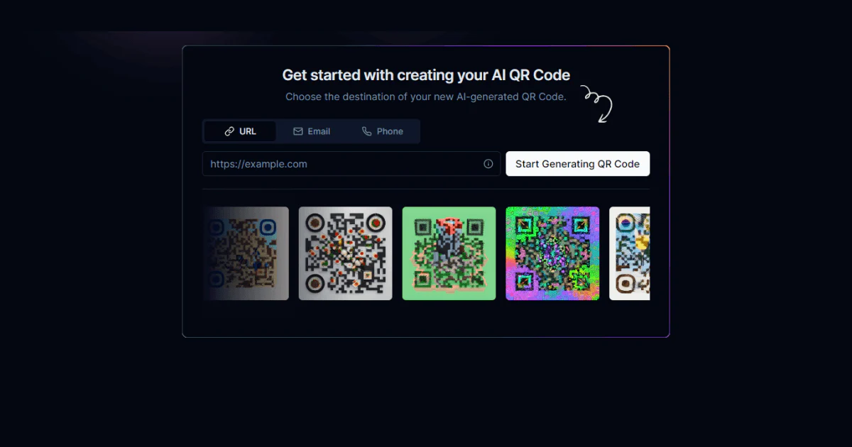
All-in-one digital solution Tapni has just launched its QRCode Toolkit, enabling you to generate versatile and customized QR codes in a few easy steps.
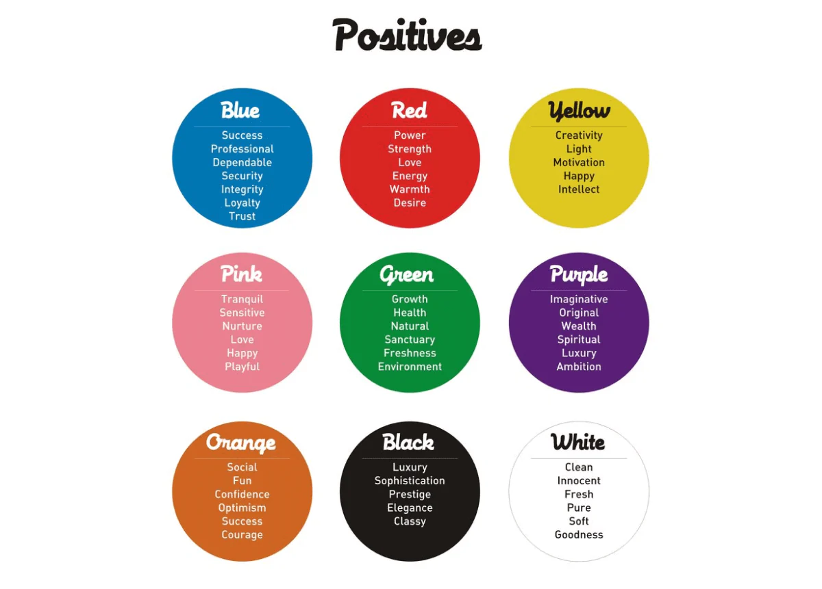
The importance of colors in graphic design extends beyond aesthetics - it involves psychological, cultural, and communicative aspects.
Colors affect our moods and emotions and are a powerful tool to attract clients.
Warm colors include red, orange, and yellow tones and usually have positive, energetic, and vibrant connotations.
These colors include shades of blue, green, and purple and have a more calming and relaxing effect than warm colors.
As the name suggests, these colors ‘absorb’ other colors' qualities and accentuate them. Neutral tones include black, white, gray, brown, and beige.
Naturally, depending on where your target market and audience are, it is also good to pay attention to the meaning of color in their culture.
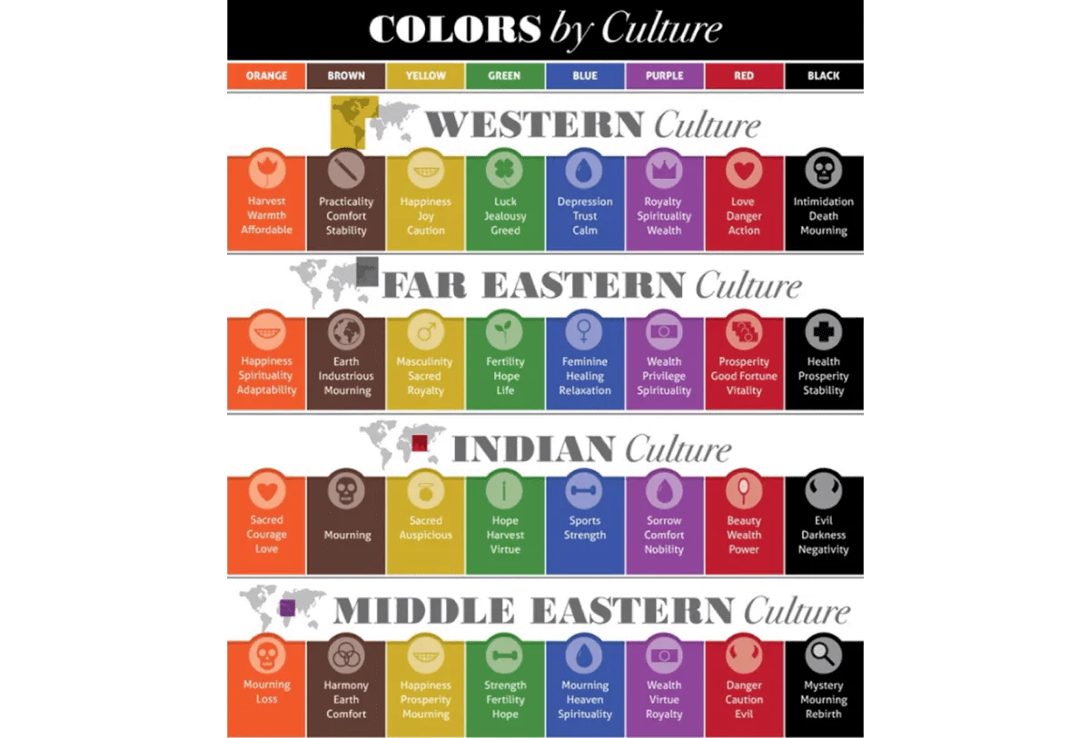
In general, there are many nuances (no pun intended) when choosing the right color, so it doesn’t harm to do some research to see what will work best for you.
👉Fun Fact: Did you know that people are 10 times more likely to keep business cards in color than white ones?
A general rule of thumb is to make your business card legible - it doesn’t mean you can’t get creative but do it with caution.
You don’t want your clients to struggle deciphering the info on your card, right?
So, what are some of the most popular business card fonts?
For starters, there are 3 main font types or categories:

Helvetica is a simple and elegant sans-serif font with clean lines, making it easy to read in various font sizes.
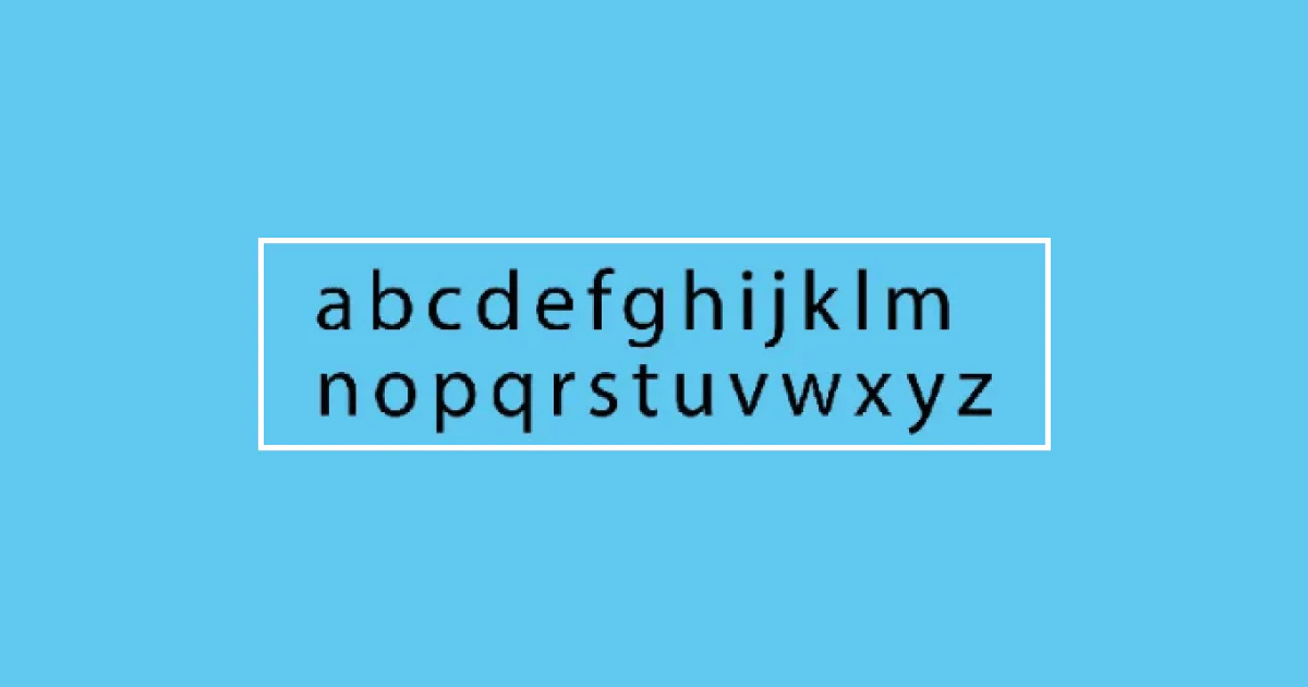
It has thin strokes and open letterforms, making it legible.
In addition, it can be a good choice if you want to incorporate other visual elements since it won’t be distracting.
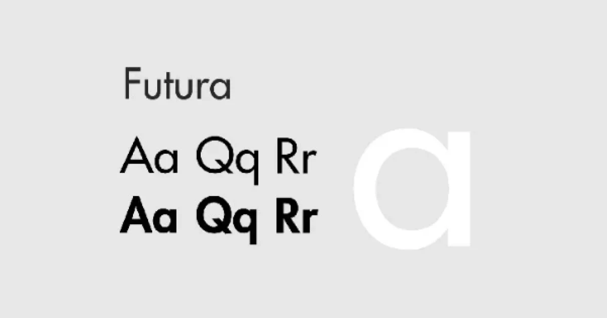
Futura is a sans-serif font combining round geometric forms, where lowercase letters are taller than the uppercase ones.
However, the space between the letters is wide, so it may not be the best solution if you plan to include much more info on your card.
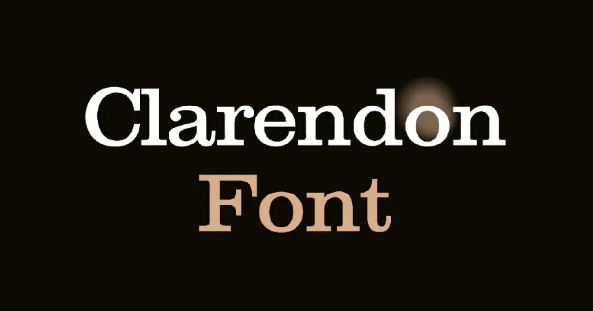
Clarendon belongs to script fons, which means it has ornamental-looking letters with elaborate curves.
Unlike some script fonts, Clarendon is well-legible and a popular choice for posters, invitations, greeting cards, etc.

Roboto is a relatively new sans-serif font, offering 6 different weights and 28 alternative styles. Due to its open and legible curves, Roboto is a popular choice for businesses.
💡Tip:
When it comes to font size, it should be between 10-16 pt for the fields containing your and your company name.
However, for fields containing your contact info, for example, the font size should be smaller, but make sure it doesn’t go below 8 pt.
Although there isn’t a definitive rule on whether you should include visuals such as background imagery or headshots, there are rules on how to make it less tacky:
Did you know that 72% of people judge a person or a company based on the quality of their business cards?
In other words, people don’t like cheap-looking business cards, and the paper quality definitely plays a part.
A general rule is to go for 16-point, 130-pound cardstock, where the point refers to the thickness and the pound to the weight of the paper.
This way, your card won’t look flimsy and will radiate a professional vibe.
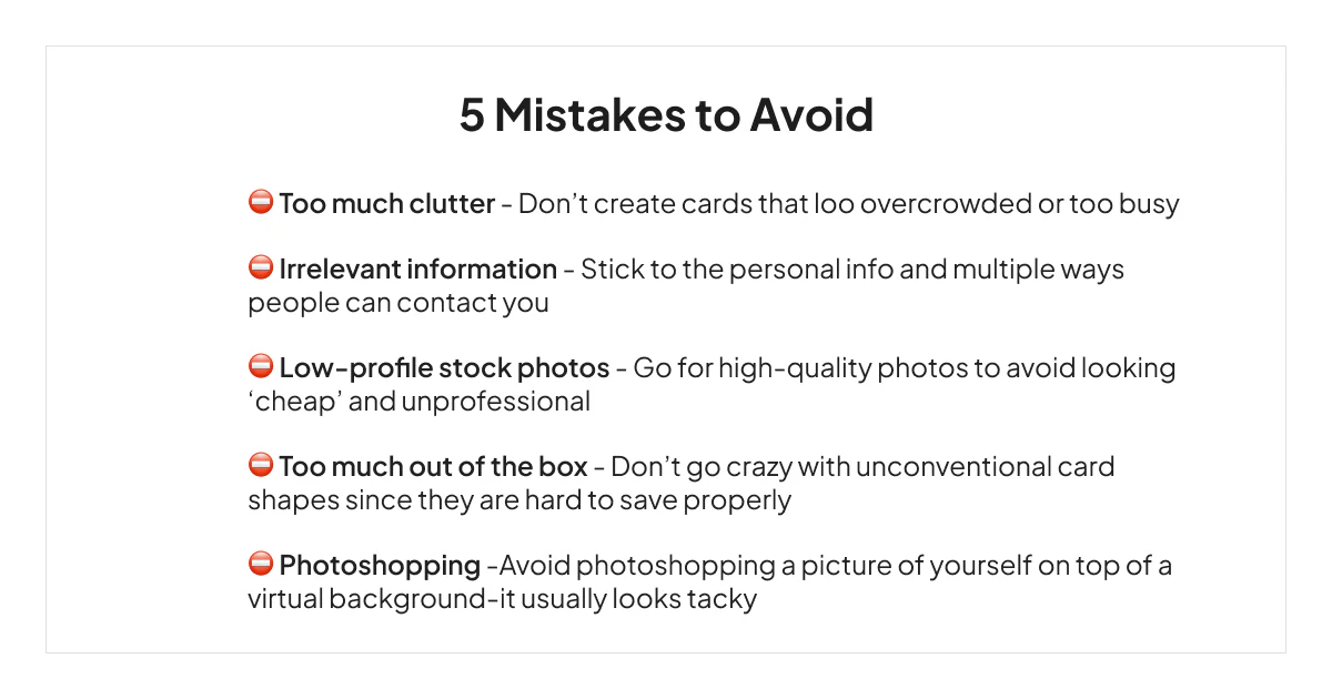
In general, make sure your business card looks professional and conveys relevant information without giving off a tacky vibe.
Now that you know all the ins and outs of designing a business card, let’s check 10 real estate agent business card ideas to get your creative juices flowing.
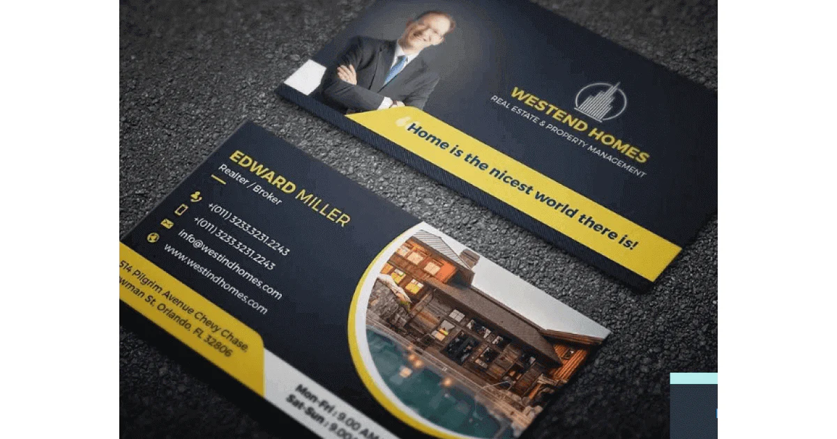
✅ Elegant and sleek design.
✅ Includes relevant info, including the website address.
✅ States the niche/specialty.
✅ Has a professional-looking image.
✅ Includes an inspirational quote.
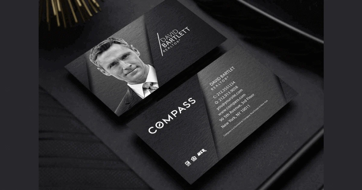
✅ Has an elegant design.
✅ Has a nice color contrast.
✅ Includes socials.
✅ Has a professional-looking photo.
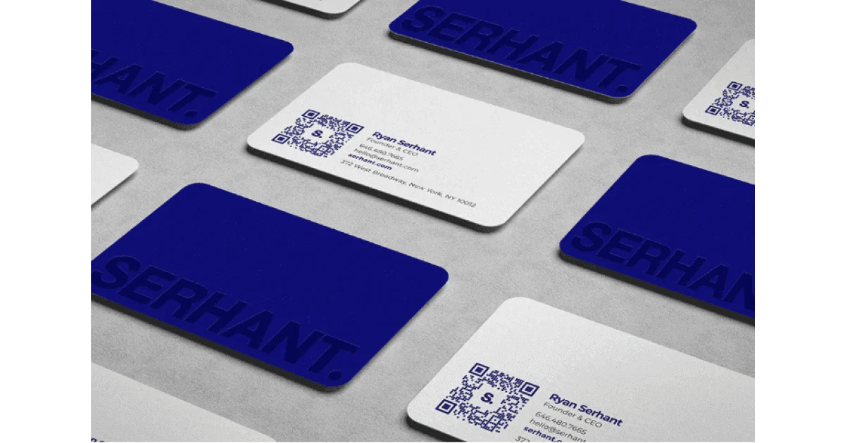
✅ Has a simple but effective design.
✅ Has a bold choice of color, but it isn’t aggressive.
✅ Has a nice color combo.
✅ Includes a QR code.
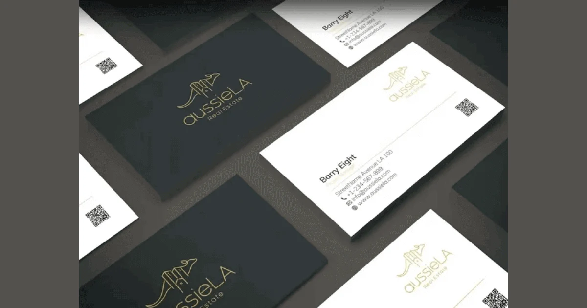
✅ Has a golden logo in great contrast with the black background.
✅ Contains relevant info.
✅ Has a legible font.
✅ Has a QR code.
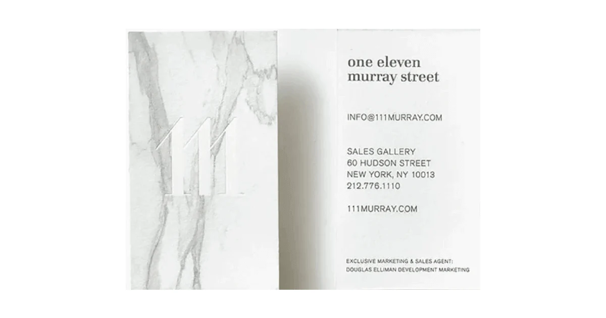
✅ Shows that white shades can be more than effective.
✅ Marble-like structure spells elegance and luxury.
✅ Has relevant info.
✅ Has a skyscraper appearance, which is quite a slim idea.
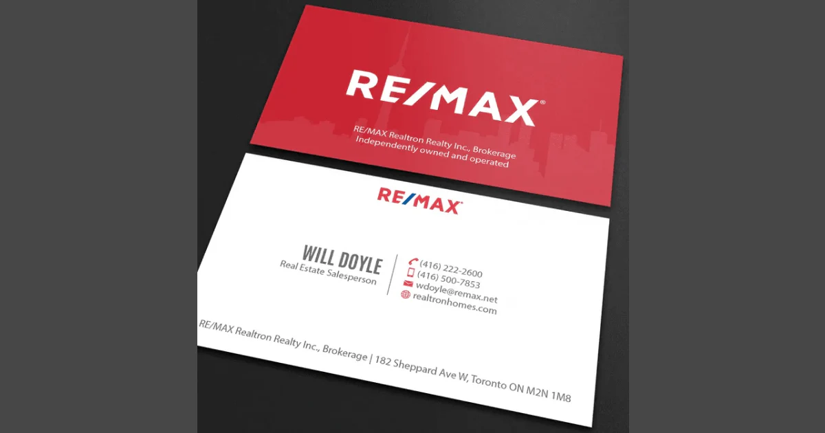
✅ A bold and effective red design with the skyline in the background.
✅ Shows specialty or niche.
✅ Includes relevant info.
✅ Has a legible and clean font.
✅ Design colors match the logo.

✅ Has a simple and clean design.
✅ Has a nice color combo.
✅ The colors of the house complement the rest of the design.
✅ Has all the relevant info included.
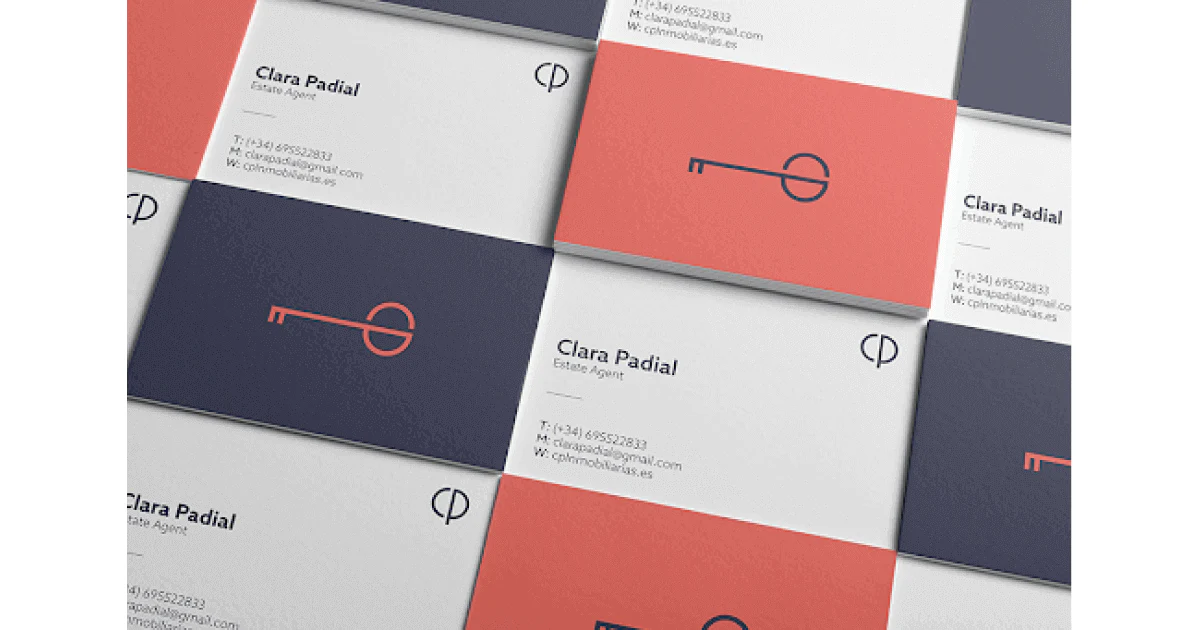
✅ Has a bold use of colors but is not aggressive for eyes.
✅ Has a great use of a key symbol, making it immediately clear what the industry is.
✅ Includes specialty or niche.
✅ Includes relevant info.
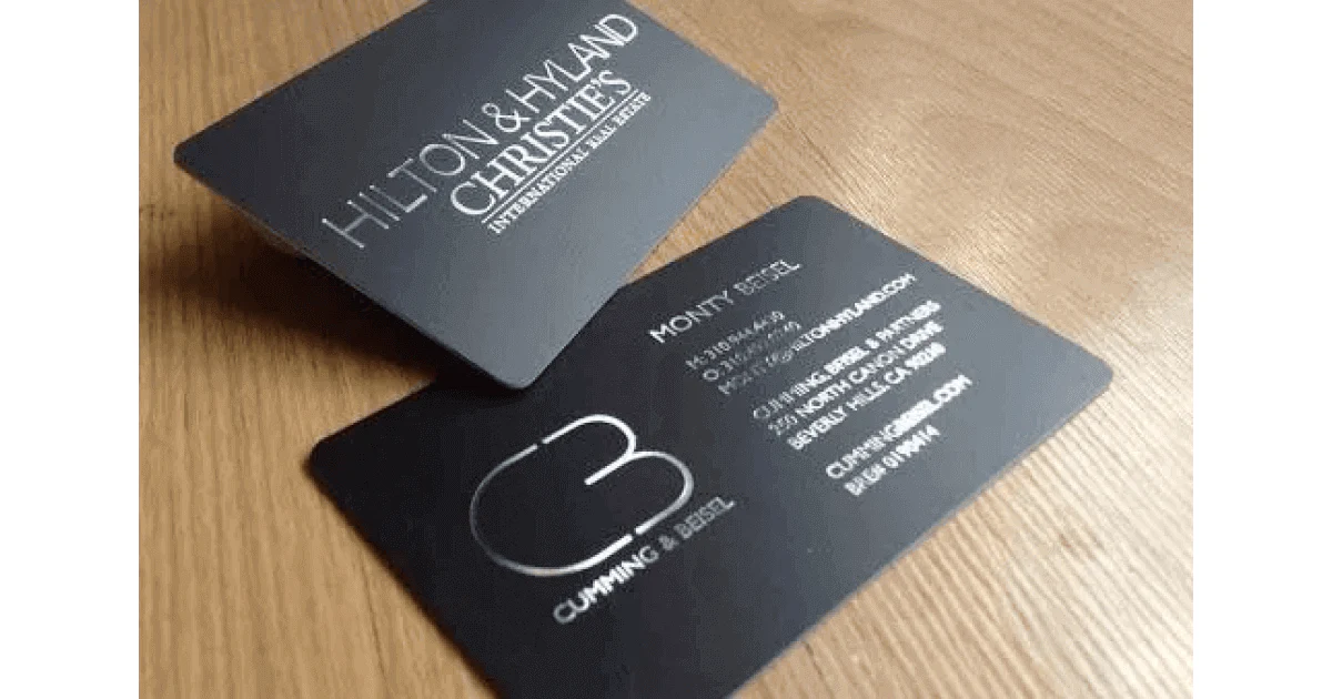
✅ Has a nice contrast between the dark background and silver letters.
✅ Has a sleek and elegant design.
✅ Has all the relevant info included.
✅ Has a reflective silver font, adding a dash of luxury.
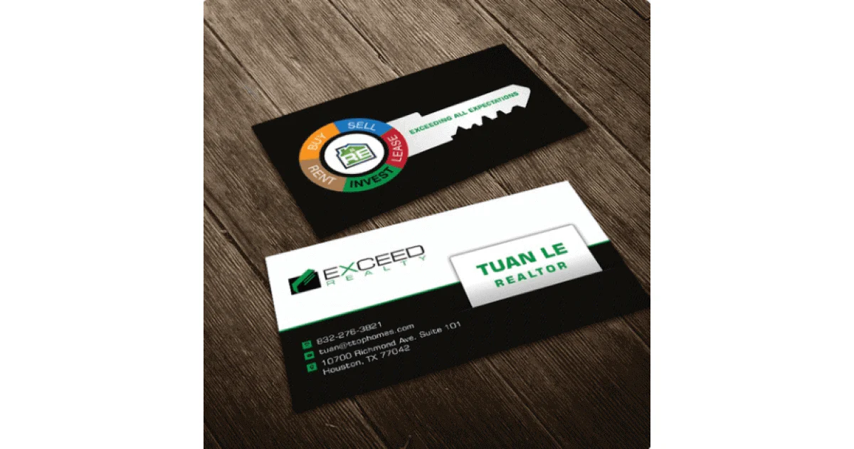
✅ Shows you can use colors in a smart way to convey your message.
✅ Has an excellent way of using a key listing your specialty without being cluttered.
✅ Has a nice green and black combo, giving it a professional vibe.
✅ Has the relevant info included in a legible font.
Our practical tips and the above examples should be a more than sufficient starting point for your business card design.
But before we wrap things up, let’s give you more food for thought.
What if there is a way to stand out even more without having to print multiple business cards? After all, 88%of business cards get thrown away.
Well, the solution comes in the form of digital business cards or NFC chip cards. They’ve leveraged the best of their paper counterparts and maximized their effectiveness.
Tapni is an all-in-one digital solution providing fully customizable digital business cards and accessories such as stickers, wristbands, standees, keychains, etc.
With Tapni, you can choose from standard cards over bamboo cards to elegant metal digital business cards in black, gold, and silver.
Each card comes with an NFC chip and a QR code, enabling quick and easy sharing.
What else does Tapni have in store for you?
✨ QRcode Toolkit - Enables you to create customizable QR codes.
✨ Multiple link types - Directs your audience to the page or social media channel you want them to see.
✨ Multiple sharing options - Allow fast info sharing by tapping, scanning, via email, text messages, etc.
✨ Paper Business Card Scanner - Scans paper business cards and turns the scanned info into a digital form.
✨ Automated lead generation - Sends your new contacts directly to your CRM.
✨ Robust analytics and metrics tools - Show your card performance, click-rate, views, etc.
✨ URL shortener - Allows you to shorten and customize your URL to meet your specific needs.
✨ and so much more.
Ready to tap into Tapni?
Download the Tapni App today and transform your business card into a powerful lead-generation tool.
6 Best Digital Business Card Ideas To Inspire You
Digital Business Card vs Paper Business Card - Which is Better?
Beyond the Card: Integrating Digital Networking Tools into Your Overall Strategy