We’ve been promised the death of the landing page for a decade, yet every serious growth team still builds them by the dozen. Social media changes, cookies disappear, and inboxes get crowded — but a clear, well-made page you own is still the fastest way to turn interest into leads.When someone clicks your ad or email, they’re handing you a few seconds of attention; a landing page turns that moment into a handshake instead of a shrug. Without it, even the best traffic campaign feels like hosting a party with no lights on. So the question isn’t whether to build landing pages — it’s whether yours are good enough to pull visitors all the way through.
A single metric shows their staying power: cost per acquisition. Brands that funnel paid traffic to tailored pages consistently spend less to gain the same or better leads than brands that dump traffic onto home pages. That’s because a landing page wipes out distractions, surfaces one clear benefit, and asks for one next step — exactly what ad-trained brains expect. In a world of infinite scroll, simplicity sells. Let’s dig into the traits that make a page convert like crazy and, more importantly, why each trait matters for lead generation.
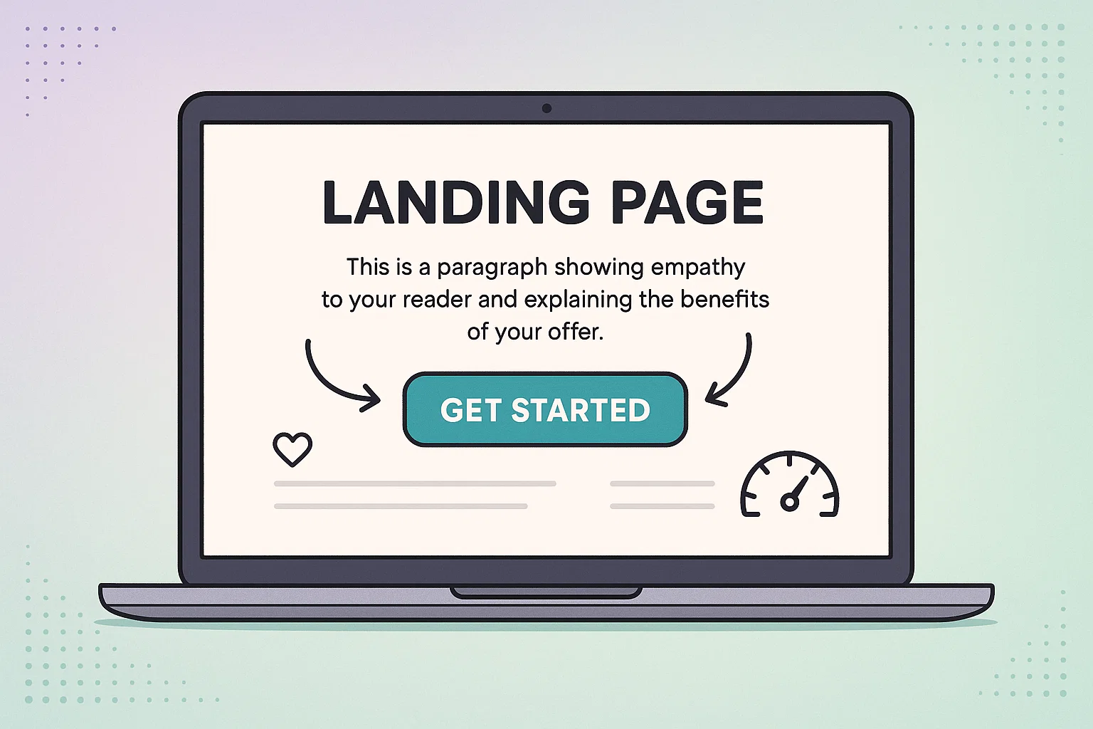
Most under-performing pages, including poorly structured Landing Pages or unconvincing Newsletter sign-up forms, fail before a visitor even reads a word: the offer is fuzzy. If your ad promises a free demo but the page starts talking pricing, users bounce. Before layout, before colors, decide on one irresistible promise and build everything around it. Templates won’t fix a confusing offer, but clear messaging can make even a rough design work. You’re persuading a visitor to trade personal info for value, so the value needs to pop off the screen in seconds.
Need inspiration? Spend ten minutes skimming some examples of clean, single-goal pages — they show how much power lives in a tight headline and one well-framed form. The exercise isn’t about copying layouts; it’s about feeling the emotional punch of an unmissable offer. Once you’ve nailed yours, you’ll see the rest of the build fall into place because every element exists to reinforce the promise.
A high-converting page never treats traffic as generic; it speaks to the exact moment a person lands. Someone clicking a top-of-funnel blog ad is colder than a prospect who just compared three competitor features. Map their route like you’d plan a road trip: what questions, hesitations, or myths do they carry into your page? When you meet those thoughts head-on, you earn micro-trust, and micro-trust stacks into conversions.
Storytelling helps here. Start where the visitor already stands — usually a pain point — then walk them to a picture of success your product unlocks. Think of the page as a short film: open with conflict, show the hero’s tool (your offer), end with an easy decision. That narrative arc keeps even skeptical scanners engaged long enough for the call-to-action (CTA) to feel like a logical next step rather than a leap of faith.
Humans outsource risk to the crowd. Testimonials, star ratings, client logos, or data snapshots act like digital nods saying, “This is safe.” Place proof near decision points—next to a signup form or directly under the headline—so skepticism doesn’t have room to grow. The best proof is specific: “Tripled qualified leads in 90 days” beats “Great service” every time because numbers anchor belief.
If you’re starting without reviews, borrow authority from another angle. Mention media features, industry certifications, or the size of your user community. Even a line like “Trusted by 1,200+ SaaS founders” reduces doubt. Remember, trust layers quickly; one solid quote plus a name logo can carry more weight than a wall of vague praise.
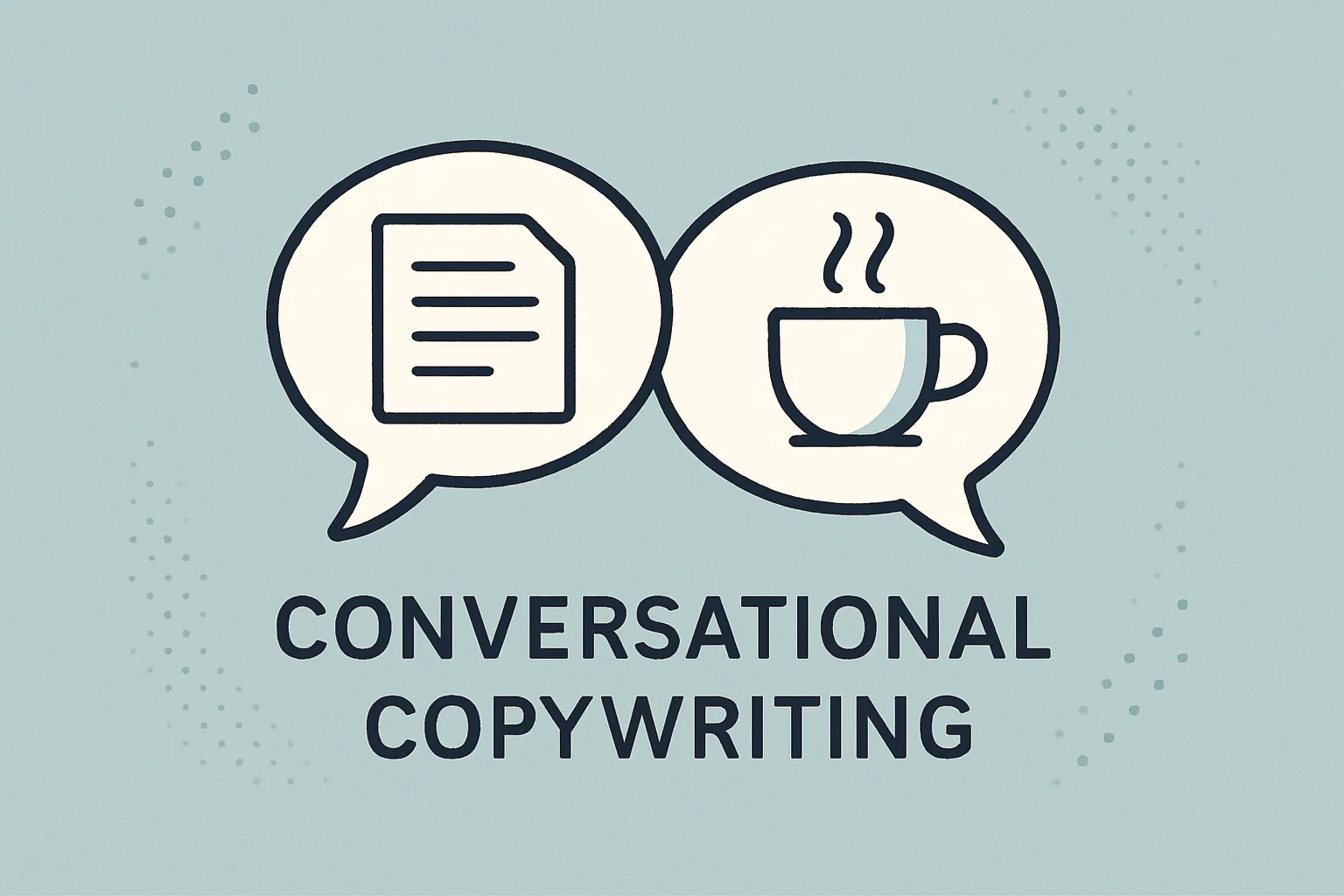
Stiff, over-polished copy feels safe to write and deadly to read. Picture your best sales rep explaining the offer over coffee: that tone converts. Use contractions, short sentences, and an active voice. Instead of listing product specs, translate features into life after adoption—“Cut your weekly reporting from hours to minutes” sparks imagination; “Automated dashboards” doesn’t.
Read your draft aloud. Any sentence that trips your tongue will trip your reader’s brain. Smooth it until it glides. Then, sprinkle micro-yeses — tiny prompts like “Sounds familiar?” or “Ready to see how?”—before the CTA. These keep momentum high and subconsciously prime visitors to click. Copy is the strand that guides users through the page; make it strong, flexible, and friendly.
Design isn’t decoration; it’s persuasion with pixels. Every color, shape, and white-space decision should aim a visitor’s eye at the conversion goal. Pick one brand color for CTAs and avoid using it anywhere else — that way buttons pop like neon arrows. Keep typography legible and backgrounds quiet so the message sings. Even animation deserves restraint: subtle motion can nudge attention toward a form, but too much movement feels like pop-up ads from 2005.
Mobile-first design is table stakes. More than half of ad clicks come from phones, and nothing kills momentum like pinch-zoom fields or blurry graphics. Preview on several screen sizes and test forms with your thumbs, not your mouse. If a field feels tedious on a train ride, shorten it. Ask only for must-have info upfront; you can collect extras in later onboarding emails.
Nothing beats a fast-loading page. Every extra second can cut conversions by up to 20%. Use smaller images, remove slow scripts, and pick fast hosting. It's boring work that pays like compound interest. A landing page that loads instantly on shaky hotel Wi-Fi feels premium; the same design crawling along feels outdated.
Core Web Vitals aren’t just for SEO — they’re real-world patience meters. Largest Contentful Paint under two seconds, no layout shift, and minimal input delay make sure your brilliant design isn’t sabotaged by lag. Visitors won’t email you to complain; they’ll just leave. So treat speed as a feature, not an afterthought.
Guessing which headline will win is gambling with ad budget. Instead, run experiments. Swap one variable at a time — headline, hero image, CTA copy — and push traffic until you hit statistical confidence. Small lifts compound; a three-percent bump in form completions can mean thousands of extra leads over a quarter. Use a tool you’ll actually open daily; an ignored analytics dashboard is as useless as no data at all.
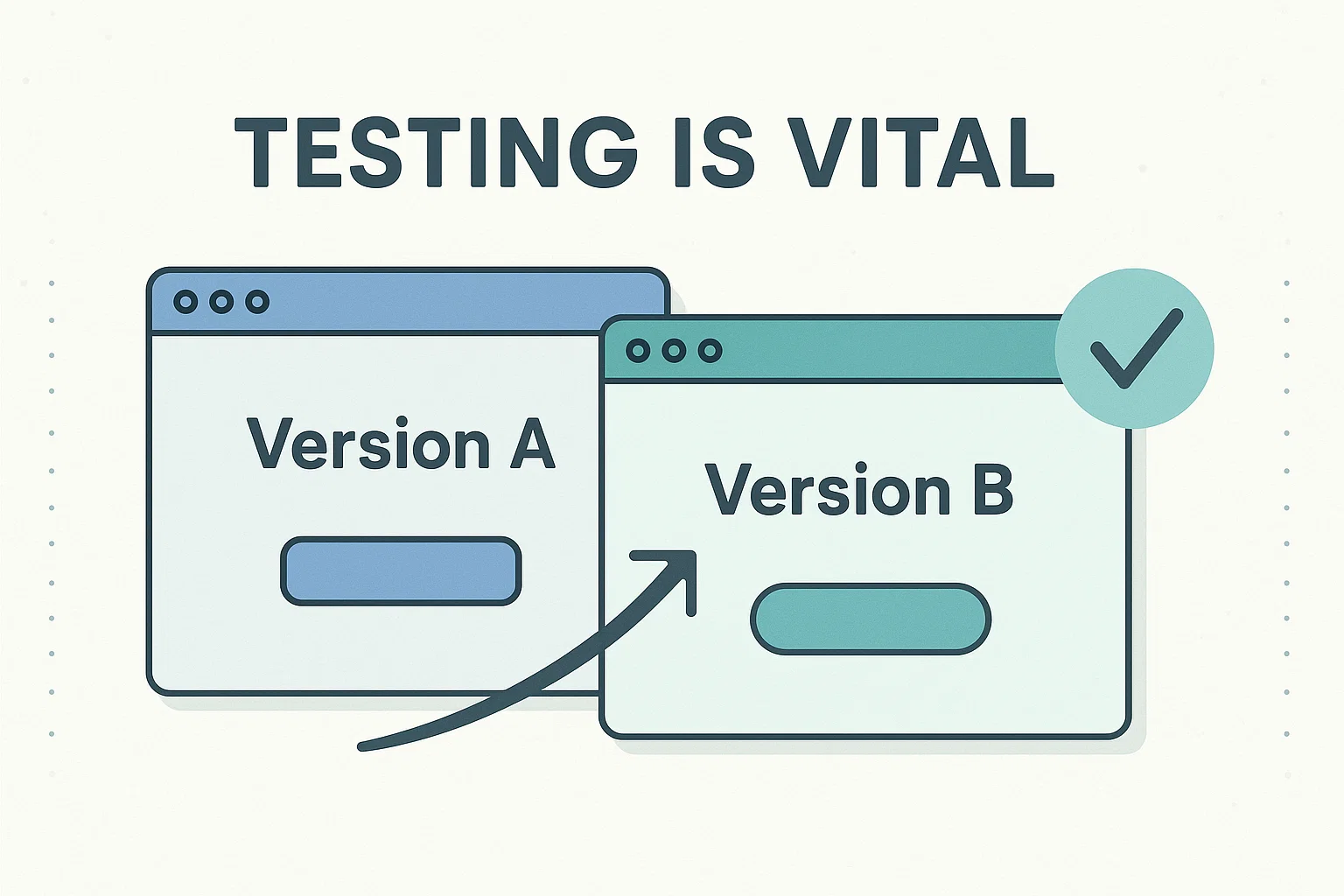
A/B testing also keeps teams honest. Your creative director’s favorite photo might lose to a boring stock image that matches the visitor’s mental model. The point isn’t to prove someone right; it’s to let customers vote with clicks. Schedule tests like workouts — consistent reps beat sporadic sprints — and share results so future pages start smarter.
Pageviews alone won’t pay rent. Track lead quality: do signups turn into booked calls, trials, or closed-won revenue? Integrate your form with CRM tags and follow leads downstream. If a page delivers double the leads but half the deal size, your real conversion rate falls. Match UTMs to campaigns so you can cut back under-performing traffic sources rather than blaming the page itself.
Heat-map tools such as Hotjar reveal where attention pools and where it disappears. You’ll spot “dead zones” where visitors stall and exit, then rearrange elements to smooth their journey. Data ownership here is crucial: when you see exactly how users behave, you can improve weekly instead of redesigning yearly.
Landing pages look like a marketing project, but the best ones borrow brains from sales, product, and even support. Sales knows objections, product knows capabilities, support knows pain points — blend those insights and your page speaks fluent customer. Kickoff meetings feel slower than typing alone, yet they prevent endless back-and-forth later.
Use a shared doc to gather headline ideas, proof points, and imagery before anyone opens a design file. Review prototypes together on a live call so feedback lands in real time. Platforms like Unbounce make quick edits simple, encouraging non-designers to tweak copy without calling a developer. When teams own the page collectively, they also celebrate wins collectively — and nothing fuels buy-in like watching a conversion graph tilt upward.
Collaboration continues after launch. Schedule a 15-minute retro each month: look at key metrics, list what worked, hypothesize next changes. That ritual keeps optimization in motion long after the hype of a new page fades. It also turns landing page creation into an ongoing learning engine that shapes future content, ads, and even product features.
High-converting landing pages aren’t a one-and-done project; they’re living assets. Audience expectations shift, products evolve, and design trends change. Set a quarterly reminder to audit your top pages: refresh screenshots, swap outdated proof, and rewrite headlines that no longer match market language. Tiny updates keep relevance high and maintain that hard-earned conversion rate.
At the same time, archive under-performing pages. A huge library drains focus and splits test traffic. Better to run ten stellar pages than fifty ordinary ones. Remember, every second you save visitors and every doubt you erase bumps conversions. Keep tightening, keep testing, and your landing pages will do what they were built for — turning clicks into clients.
About the author :
Ralf Herrmann is a content editor and UX writer focused on creating clear and visually appealing email layouts. In his spare time, he researches typography and design trends.
